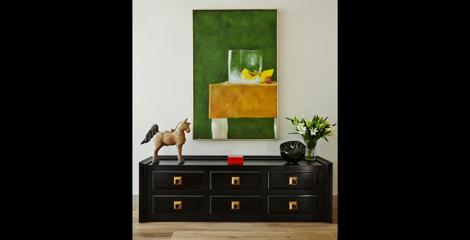
As Equestrian Living magazine visits the homes of horse lovers around the country for our well-known photography features, we’ve grown accustomed to the expected English hunt-country look that we all know so well: heirloom oriental carpets, leather club chairs, hunt prints, and antiques, with perhaps some overstuffed chintz couches thrown in.
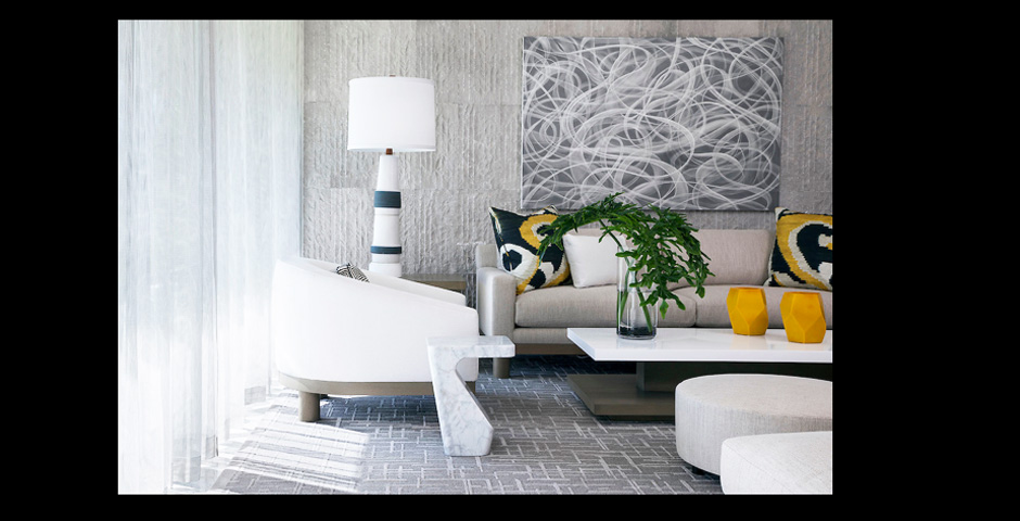
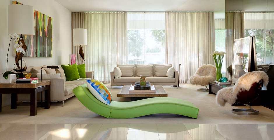
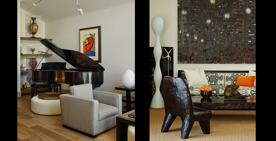
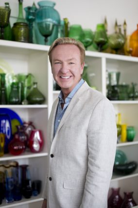
But after visiting several beautiful homes created in a striking, modern style that also incorporates equestrian-accented design, we began to see a common thread: designer Vance Burke.
As The Huffington Post’s “Finephilia” blog noted, “Not many people can say they were classmates with Tom Ford in Paris and have remained friends since. As two young men, interior designer Vance Burke and fashion designer Tom Ford would admire the rise of Yves Saint Laurent and Karl Lagerfeld and how they were peers and also friendly rivals. Burke and Ford would often joke with each other that they, too, would be famous one day. Their paths proved to be similar in spirit yet different in design direction. Ford made his way into fashion, while Burke took the interiors path.”
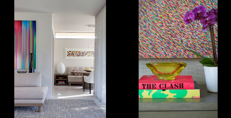
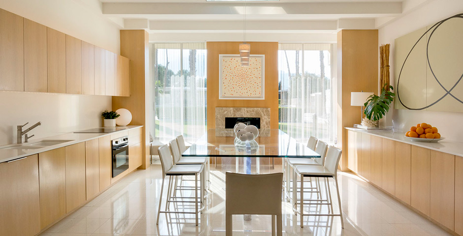
Burke is based in Santa Monica, California, and divides his time between the beach town and his midcentury-modern home in Palm Springs that he calls his design lab, where, he says, he “pushes the envelope with new colors and ideas.” The desert home has been widely published in design magazines.
When we learned that Equestrian Living magazine’s editor at large, Carol Cohen Hodess, has worked with Burke on several of her homes, we invited her to interview the designer.
You were brought up in the Midwest, in Kansas?
Smack dab in the middle of nowhere. I wanted to move to New York, so I went to a design school in the city, and then I went to Paris for a while. That’s when Tom (Ford) and I got to be good friends. And, in fact, later when I moved to L.A., he hired me to help with his house in Texas. He was also one of my first clients. We don’t really see each other that much anymore, but he is a great friend.
After school, I started doing design work in New York. First I worked for Donghia Associates for a couple of years, and next I went to Parish-Hadley, which was an old, blue-blood decorating firm that actually re-did the upstairs of the White House when the Kennedys lived there. Next I went to work for the designer Jed Johnson, who, as you may know, lived with Andy Warhol for a long time, and he helped shape some of Andy’s collection. Naturally, through Andy, Jed had some great clients such as Mick Jagger and Richard Gere.
After Jed was killed in a plane crash, I moved out to Los Angeles, and I started working for myself. I was lucky that I got some good commissions right off the bat. I did some work for Ellen DeGeneres and Michael Richards, who played Kramer on Seinfeld. I also got several great commissions with some art collectors, too, which took me in another direction.
I always call myself a decorator, not in a derogatory way, but in a really good way that some people don’t understand. I don’t think it’s a negative. I always see the trilogy of art, architecture, and decoration going together. I don’t see the hierarchy of one being better than another—I think there’s a combination of all in everything.
How do you work?
It’s a collaboration between architect and decorator, and decorator and client. It’s a constant collaboration, all throughout the whole process. I always try to make it nice and fun and unstressful. I know that building a house or decorating can be stressful because the time and money involved can cause a little friction, so I try never to bring any friction to the table. Everyone has different priorities as to what’s important to them, and I want to listen to what makes them happy and what could be an issue for them. I get on board with what’s important to the client versus what’s important to me. There are multiple versions of what’s right. There’s not just one version. Obviously, there are some things that are wrong—that I try to steer people away from—but there’s not one right solution to any problem solving when it comes to design.
In design, I always think it’s important to create an experience that’s consistent. If you have an old house, you don’t automatically have to have old furniture inside—or the opposite—you can do something brand new and put antiques in it. You want to create an experience from the moment you drive up and hear the crunch of gravel, and look at the landscaping, and see the architecture, and go inside and see the upholstery and the rugs and the art. You want it to all feel like one unique, special, experience, and that changes over time and also changes with where you are in location or where you are in your life.
How do you approach adding “equestrian” into modern interior design?
Why start telling the story in the middle or near the end? In my experience, horse people are all-in right from the beginning.
I would literally start from the ground up with reclaimed-wood floors or a rough-cut stone—something that has an earthy, organic integrity. I would juxtapose slick modern walls with a high-contrast, dressage-inspired color story—perhaps saddle leather, off-white linen with dark navy or black accents, or lacquered walls. When we do get to the accessories, my mantra in modern design is fewer, bigger, better. This is where we would continue the story with the artwork selected—a Deborah Butterfield sculpture, maybe a Susan Rothenberg drawing, minimalist black and white photography, or even the Zen of a Tang dynasty horse.
Is there anything unique about equestrian clients?
We all live in a bubble, most of us one of our own making. But perhaps the group most excelling at this condition is the horse world. I always find it to be a fun project when the client is really passionate about something, and I’m more than happy to jump aboard and be the conductor of their fantasy train.
I understand that their horses are sometimes more family than their family. They live with the horses, travel with them. But it’s always perplexing to me when the spaces, architectural details, finishes, and fixtures in the barn are nicer than in the main house.
Do you encounter equestrian-fashion trends in interior design?
Fashion typically leads the way, especially when it comes to color stories. Think of the 1980s equestrian style. Dark, heavy, jewel-tone colors spring to mind—burgundy and emerald, and patterns in paisley and plaid.
But fashion, like decorating, is about robbing the past to create the future, or combining the past with the present to be both modern and classic, simultaneously. This, I think, is something that Hermès does very well. Is that a cape or a horse blanket?
One of your only personal horse experiences was a ride-a-thon in India.
I had only taken a few riding classes in Burbank, California, to get ready to go to India and ride horses for two weeks. We rode Marwari horses, which were formerly used as war horses. It was an incredible trip, but there was obviously a big difference between riding around a raked ring in Los Angeles and riding in the middle of India, with potholes.
Was it scary?
Yes, it was scary! My friends are accomplished riders, but there was a woman along who works for Mark Burnett, the producer of Survivor, and she and I were terrified. We laughed and said we could always get a car service back to New Delhi, but somehow we made it through.
The first night we got there, it was around 5:00, the sun was setting, and they were deciding which horse we were going to have for two weeks. They had everyone ride a horse so they could see what our abilities were, and then they matched us up with horses they thought were best. Only at the very end of the trip did we find out it actually had nothing to do with our ability. It was all about our weight, and I was put on one of the most aggressive horses.
Have you been riding since?
That sort of put an end to my riding.
Now you are designing furniture and products?
Yes. We’re going to do a fabric line, and we’ve put the palette together that we’re going to use. We have some of the design in the preliminary state, and then we’re going to start printing them as strike-offs and determine what we really want to fabricate.
What’s your retirement plan?
To die early.
See the full article and full sources and image captions in “Equestrian Living June/July 2017.

